Surfside sits at a rare intersection of natural beauty and urban sophistication. The barrier island geography, narrow, low-lying, bracketed by the Atlantic and Indian Creek, demands an architecture that responds to water, wind, and light with equal measure.
Our design philosophy begins with the site itself. Before a single line is drawn, we study the sun path across every season, the prevailing ocean breezes, the mature tree canopy that gives each street its character. These observations become the foundation of every spatial decision.
Material selection in a coastal environment requires both beauty and resilience. We favor marine-grade metals, impact-resistant glazing, and natural stone that develops patina over decades rather than deteriorating. The palette stays warm, coral keystone, oolitic limestone, white-washed concrete, echoing the soft tones of sand and sky.
The most luxurious thing a home can be is effortless to maintain.
The interplay of indoor and outdoor space is paramount. Every residence features deep overhangs that create shaded outdoor rooms, retractable glass walls that dissolve the boundary between interior and garden, and rooftop terraces oriented to capture both sunrise over the ocean and sunset over the Everglades.
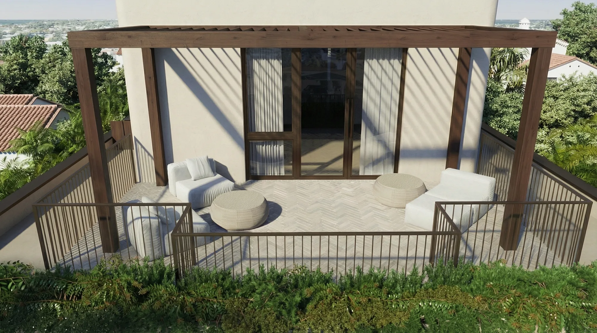
The 9017 Carlyle terrace blurs the line between interior and landscape.
Proportion matters more than size. A perfectly scaled entry sequence, the approach, the threshold, the first glimpse of the interior garden, creates a sense of arrival that no amount of square footage can replicate. We obsess over these moments because they define the daily experience of home.
Sustainability isn’t an add-on; it’s woven into the architectural DNA. High-performance envelopes reduce energy demand, rainwater harvesting systems feed landscape irrigation, and native plantings replace thirsty lawns. The most luxurious thing a home can be is effortless to maintain.
The Material Palette: Stone, Wood, and Light
Material selection is where architecture meets craft. The surfaces you touch, the textures that catch light, the weight of a door handle, these tactile moments define the character of a home far more than any floor plan.
We begin every project by assembling a physical material board: actual stone samples, wood veneer swatches, metal finishes, fabric cuttings. Digital renderings can suggest, but only touch can confirm. Each material must earn its place through both beauty and performance.
Stone is the foundation of our palette. We favor natural varieties with depth and movement, Calacatta marble for its dramatic veining, Taj Mahal quartzite for its warm translucency, coral keystone for its connection to the local geology. Every slab is hand-selected at the quarry.
An Urban Blue Group residence isn’t meant to look new forever, it’s meant to look better with time.
Wood provides warmth and rhythm. White oak, rift-sawn to minimize grain pattern, appears in cabinetry, flooring, and millwork throughout. Its quiet consistency allows the more dramatic materials, stone, metal, glass, to take center stage where appropriate.
Light is the invisible material. We design for it as carefully as we specify stone or timber. The orientation of windows, the reflectivity of surfaces, the depth of reveals, all are calibrated to ensure interiors feel luminous without glare, warm without darkness.
The result is an aesthetic that transcends trends. Natural materials age gracefully, developing character over years and decades. An Urban Blue Group residence isn’t meant to look new forever, it’s meant to look better with time.
The Art of Interior Curation
Interior design at this level isn’t about decoration, it’s about orchestration. Every element in a room must contribute to a coherent whole: the scale of the furniture, the texture of the fabrics, the temperature of the lighting, the negative space between objects.
We approach each project as a narrative. The entry establishes the theme, the living areas develop it, and the private spaces offer a quieter, more personal resolution. This arc of experience gives a home emotional depth that transcends mere aesthetics.
Sourcing is global and obsessive. A custom credenza might be fabricated by a woodworker in Copenhagen, upholstered by an atelier in Milan, and finished with hardware cast by a foundry in Connecticut. We don’t source globally to be exotic, we do it because the right artisan for each element might be anywhere.
Luxury should reduce anxiety, not create it.
Color is used sparingly and with intention. Our base palette is warm neutrals, ivory, sand, greige, soft gray, that let natural materials and light do the expressive work. Accent color, when it appears, arrives through art, fresh flowers, or the occasional statement textile.
We design for real life, not photoshoots. Sofas are deep enough to nap on. Kitchen surfaces can handle hot pans. Fabrics resist stains from red wine and sandy feet. Luxury should reduce anxiety, not create it.
The ultimate measure of our work is invisible: a home that feels so natural, so right, that its occupants forget it was designed at all. That’s the highest compliment, when design disappears into living.